
RAREWAY: FIND YOUR NEXT ADVENTURE
Case Study • UI Design • 2026
Tools: Figma and Adobe Illustrator
Scope: Branding, Wireframes, UI, Responsive

The Scope
A REBRAND WITH PURPOSE
This project began as a redesign of Wayfarer, an AI-powered travel platform that helps users discover their next vacation based on hobbies, budget, and travel duration. Early on, I made the decision to rebrand entirely, renaming it Rareway.
The name communicates the idea of a rare find, a destination you wouldn't have discovered on your own. It also gave my portfolio a distinct edge, setting my work apart from others working with the same brief.
THE PROBLEM
Generic travel platforms feel transactional. Users scroll through endless lists and never feel like the recommendations were made for them.
THE GOAL
Design a personalized travel discovery experience that feels exploratory, warm, and genuinely tailored to who you are and how you travel.
DESIGN INTENT
Surface hidden gems alongside well-known spots, all personalized to the user's travel style, hobbies, and budget.
MY ROLE
End-to-end UI designer: inspiration research, wireframing, visual design, component iteration, and responsive layouts across all breakpoints.
01 - The Process
5 STAGES FROM CONCEPT TO LAUNCH
The project followed a structured design process, moving from visual research through wireframes, style development, component design, and finally responsive adaptation.
Inspiration & Research
Vintage travel stickers, editorial photography, illustrated posters.
Wireframe
Structure before style, locking in layout and key interactions.
Visual Style
Color system, typography, and photography direction.
Components & Form
Multi-step recommendation form and card iterations.
Responsive & Rebrand
Desktop, tablet, and mobile with full Rareway identity.
02 - Inspiration
BUILDING A VISUAL LANGUAGE FROM VINTAGE TRAVEL REFERENCES
Before touching Figma, I built an inspiration board to define the emotional tone of the platform. I was drawn to vintage travel stickers and illustrated postcards, imagery where each destination is reduced to a single, memorable visual moment.
That aesthetic felt right for Rareway: approachable, nostalgic, and optimistic rather than transactional. Key references included illustrated travel posters with bold simplified color palettes, travel editorial photography where the human figure creates a sense of scale and wonder, and layered ticket-style graphics that suggest movement and energy.
Design Direction
I was also influenced by travel booking interfaces that let imagery lead before the details, encouraging exploration rather than task completion. This became the core principle that shaped every layout decision.
03 - Wireframe
STRUCTURE BEFORE STYLE
The wireframe stage was about locking in structure without the distraction of color or imagery. The hero layout established what would become one of Rareway's most distinctive visual elements: a sticker-shaped text card overlaid on a full-bleed travel photograph, paired with a circular "Start Your Search" badge.
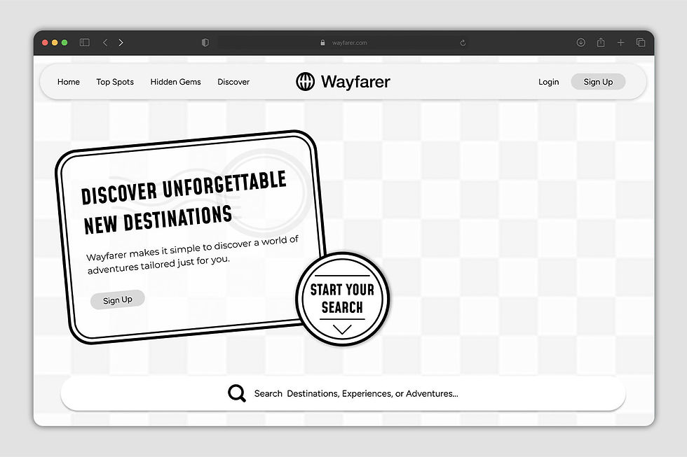
Key Decision
The sticker-card hero treatment was established at wireframe stage, not as a styling choice, but as a structural one. It defined the visual identity of the entire project before a single color was applied.
The navbar kept navigation minimal with four core links centered around discovery: Home, Top Spots, Hidden Gems, and Discover. A persistent search bar below the hero reinforced that this is a platform built around exploration.
04 - Visual Design
FROM WIREFRAME TO FULL COLOR
The wireframe stage was about locking in structure without the distraction of color or imagery. The hero layout established what would become one of Rareway's most distinctive visual elements: a sticker-shaped text card overlaid on a full-bleed travel photograph, paired with a circular "Start Your Search" badge.
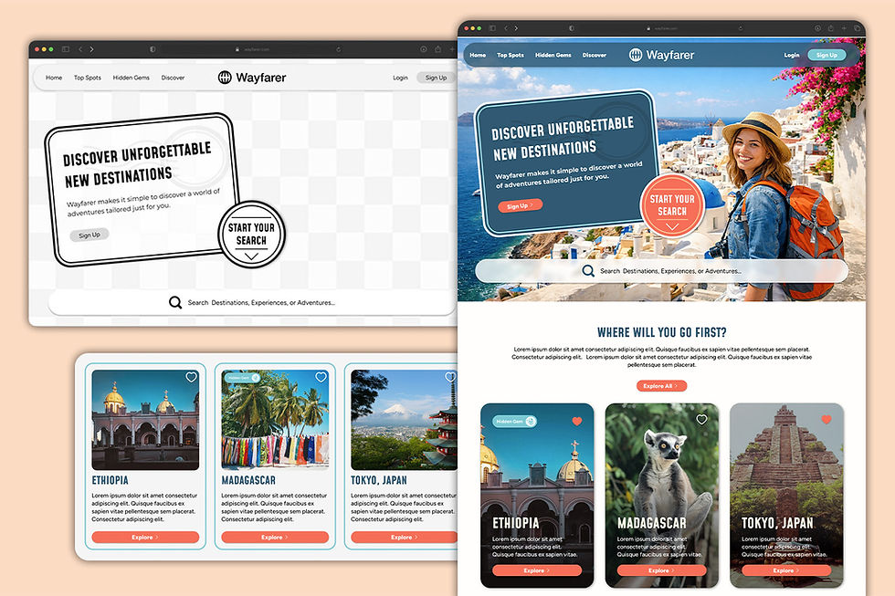
The destination cards went through two distinct design directions. After receiving instructor feedback, the darker cards with stronger visual hierarchy and better legibility against photography were chosen as the final direction.
"You have a good eye."
Feedback — Card Component Review
05 - Core Interaction
THE MULTI-STEP RECOMMENDATION FORM
The multi-step recommendation form is the heart of Rareway's value proposition. Rather than presenting a generic search bar, users are guided through a short discovery process: selecting travel activity preferences, choosing accommodation styles, inputting trip details, and entering their contact information.
The form uses a four-step progress indicator to reduce friction and set expectations upfront. Icon-based selection cards for preferences make the experience feel more like a quiz than a form, approachable and personality-driven. The final confirmation screen reinforces the brand promise with a warm "Your next adventure is being planned!" message.
Design Direction
Following instructor feedback about button overuse, the hero was simplified by removing the extra Sign Up button to reduce visual clutter and let the primary CTA speak more clearly.

06 - Responsive Design
ADAPTING ACROSS ALL THREE BREAKPOINTS
Responsive design was one of the most technically challenging, and ultimately most rewarding, parts of this project. The desktop layout uses a three-column card grid, a wide-format hero, and a horizontally organized footer. Adapting these to tablet and mobile required rethinking how each component behaves at a narrower width.
On mobile, the destination cards shift to a horizontally scrolling carousel with pagination dots, maintaining the browsing feel of the desktop experience. The search bar consolidates into a compact version with quick-filter tabs for faster input on small screens.
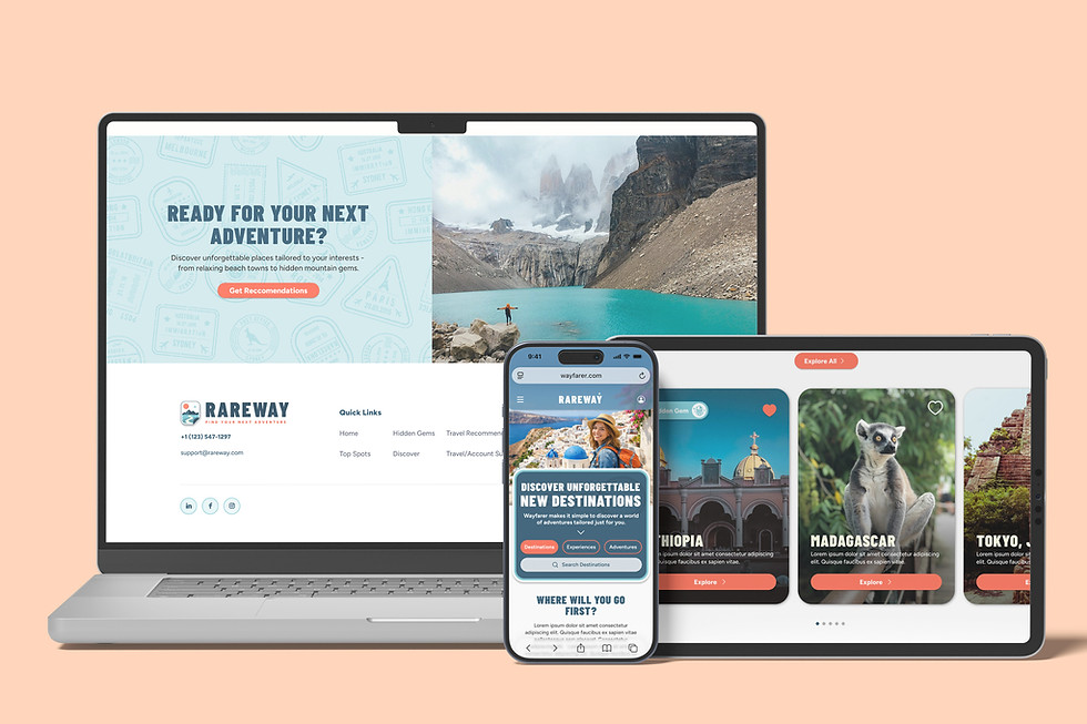
"Normally, I recommend avoiding text on images for legibility, but you have done a great job here. It is legible and accessible!"
Feedback — Card Component Review
07 - Reflection
WHAT THE PROCESS TAUGHT ME
The biggest visible evolution was the logo and overall brand identity. Moving from the generic Wayfarer globe mark to a custom Rareway lockup with the "Find Your Next Adventure" tagline gave the entire design a sense of intentionality it hadn't had before.
FILE ORGANIZATION MATTERS
Keeping layers named, components structured, and frames logically ordered made iteration dramatically faster across breakpoints.
FEEDBACK ACCELERATES GROWTH
Instructor feedback confirmed my card direction when I was second-guessing it and pushed me to simplify the hero. Both changes made the design stronger.
FIGMA FLUENCY
Coming in with limited experience, I built reusable components, a multi-step form with interactive states, and a full design system by the end of the project.


